
Brand identity & packaging design
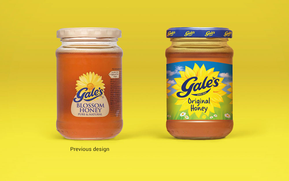
Gale's had no investment in over a decade and was becoming lost and forgotten. With the support of a strong loyal following, and a fantastic history, we gave Gale's another chance to sweeten family life once more.
Sweetening life once more
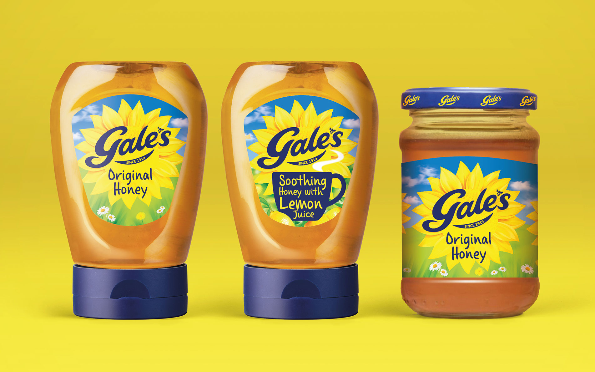
Building on the existing visual equities we refreshed the brand identity and pack design to rekindle the fond memories of a once loved brand. We took the brand outdoors into a sunny meadow and restored the sunflower as the rightful brand property for Gale's but making it relevant to-today. To help optimise standout, we simply turned the pack upside down and created bespoke shelf ready packaging.