

Brand strategy, brand identity,
packaging design & guidelines
Linwoods was fast becoming a well-kept secret in spite of the growing "Wellness" trend. The pack was working hard to communicate all the incredible benefits but messages were competing and weren't getting through to anyone looking for something nutritious.
Working together, we reduced the brand down to its essence: "small effort; big reward" which reflected the founder's philosophy around making small changes every day to live a healthier lifestyle.

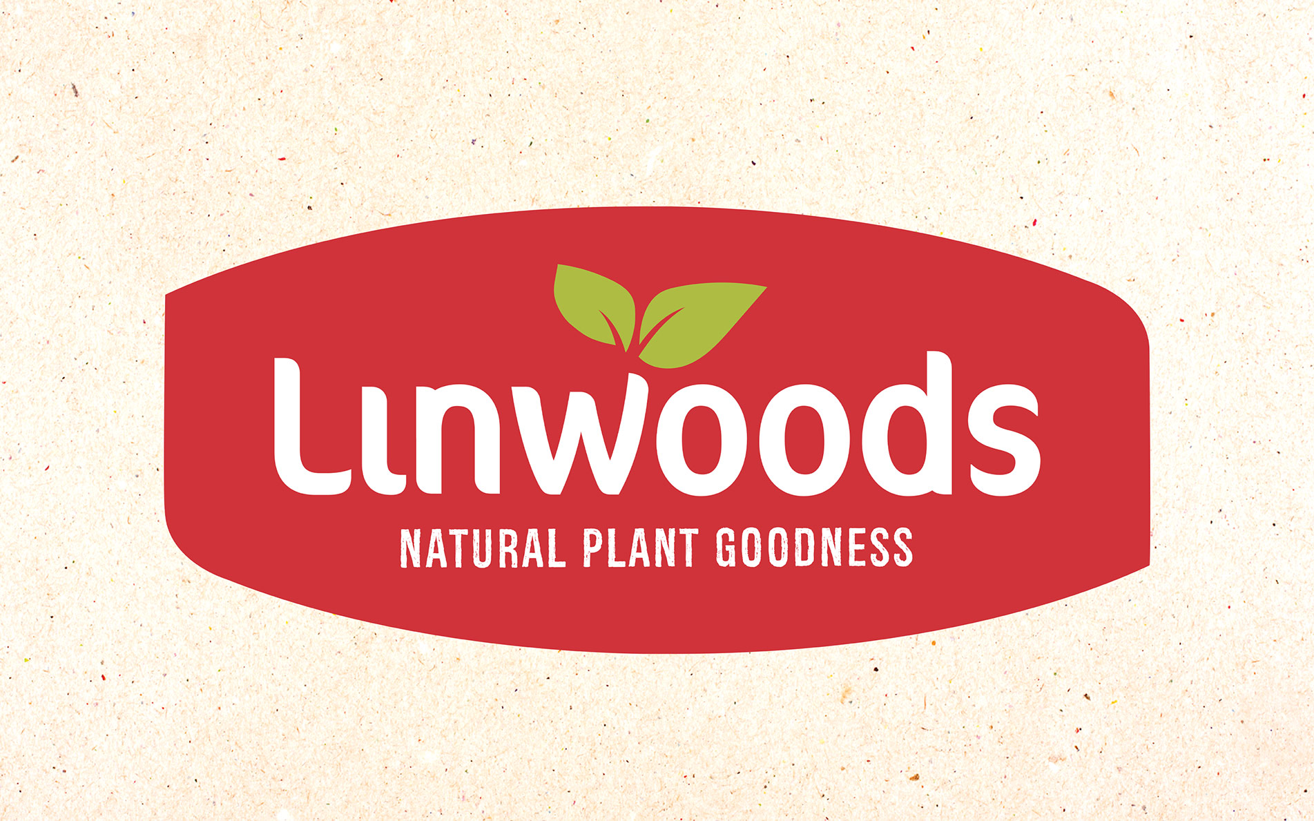
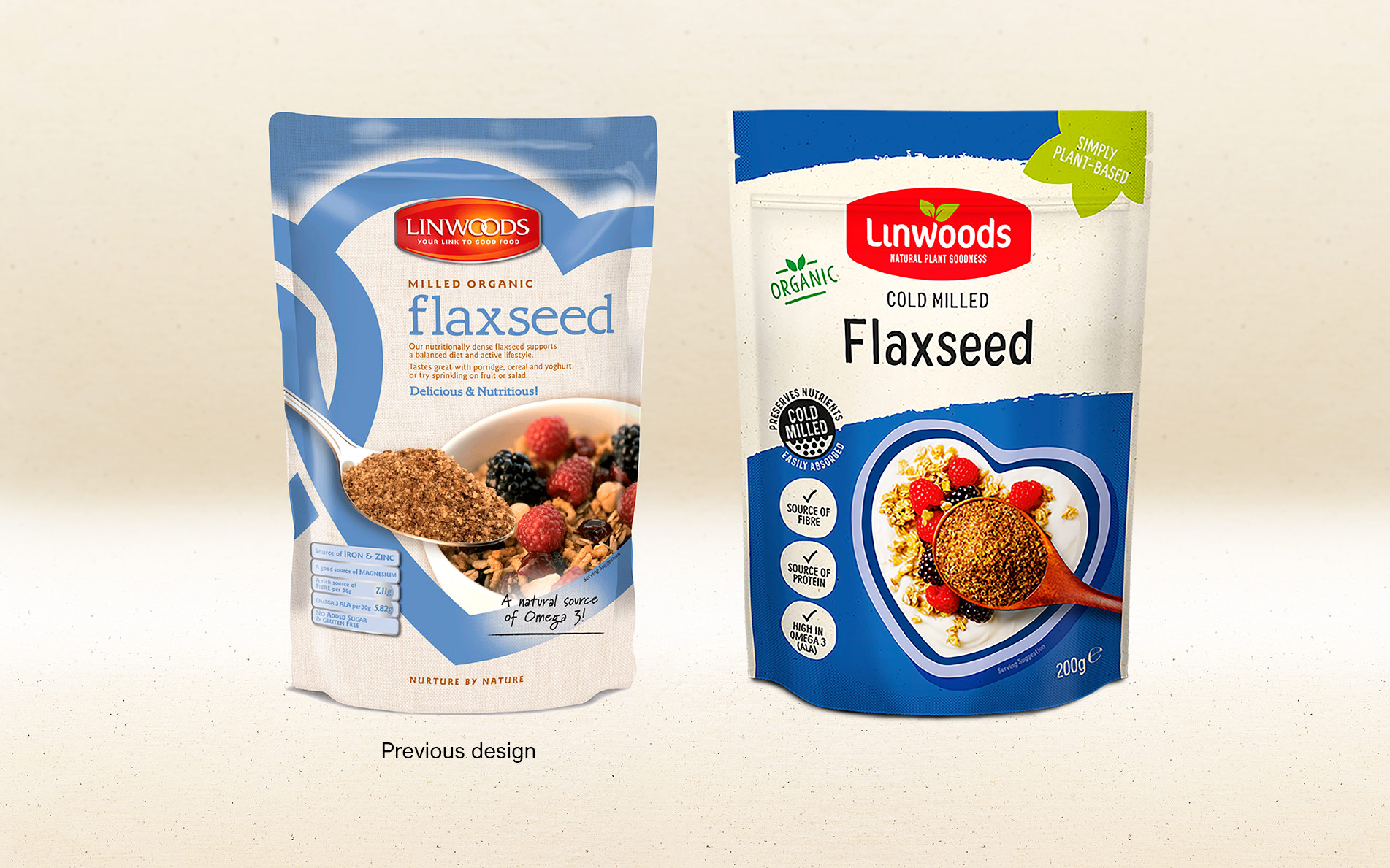
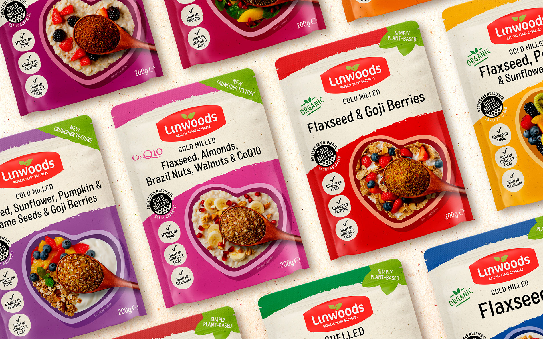
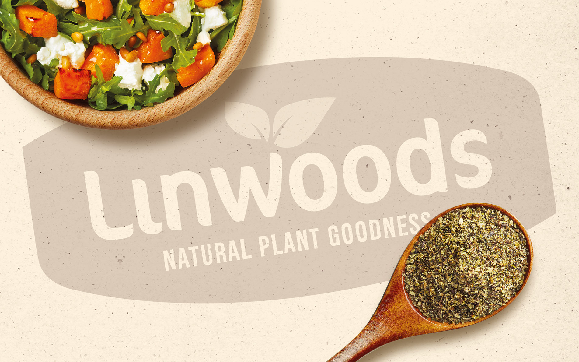
Our design objective was to reinvigorate without losing recognition; retaining the spoon to literally represent the "small" effort required and introducing a plant base purpose to the brand mark. We created a less corporate and more caring personality with heart shaped bowls and benefit messages prioritised to match those which people were looking for, and which the brand performed best against.
New brand assets were extended to other product ranges to visually connect back to the core brand whilst allowing the personalities of the sub-brands to be distinctive and relatable to specific ranges and benefits.
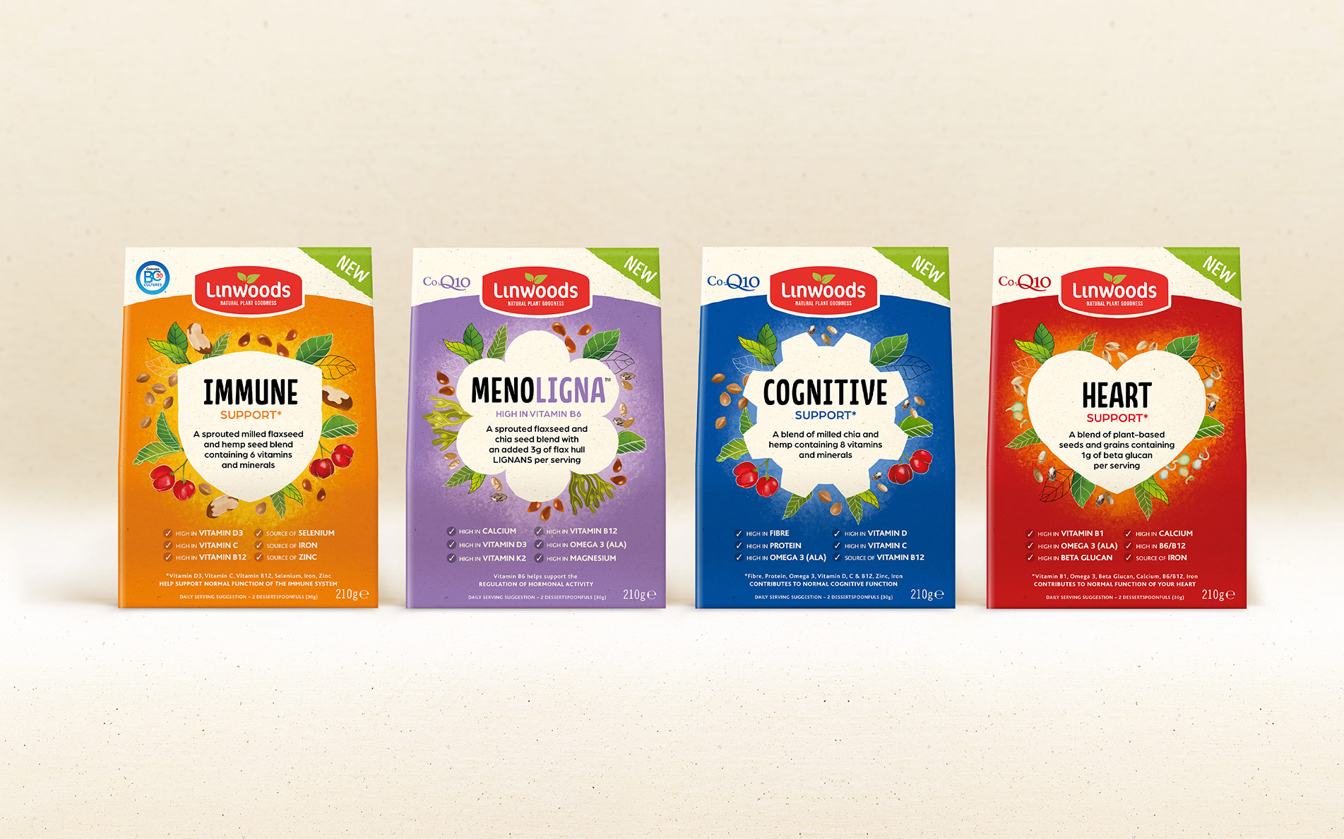
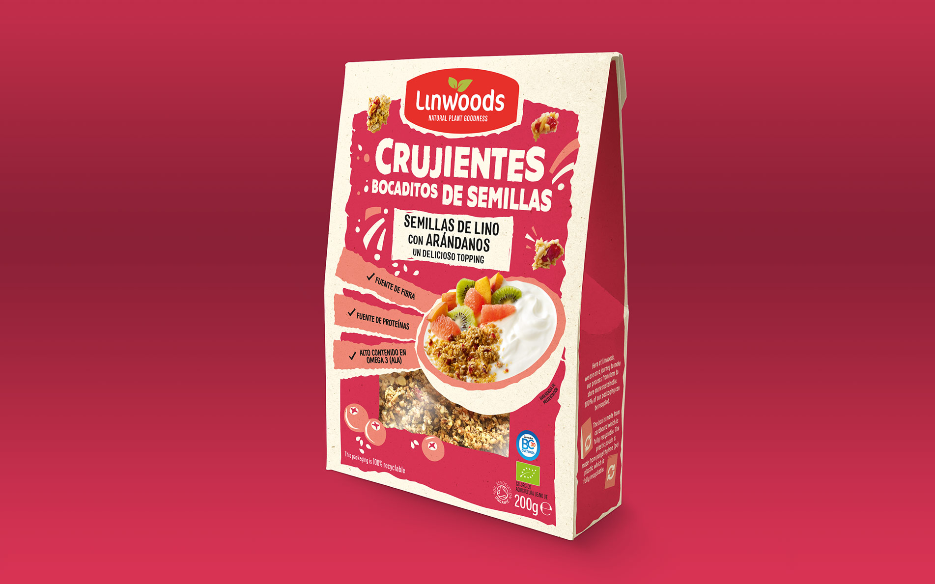
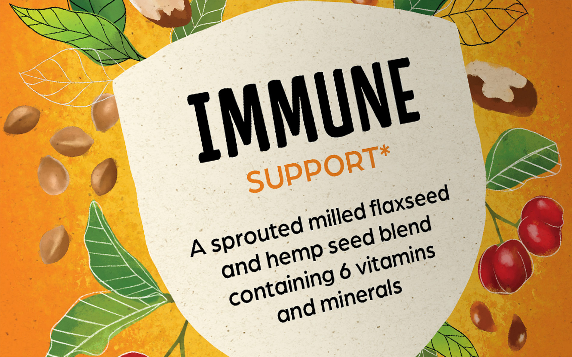
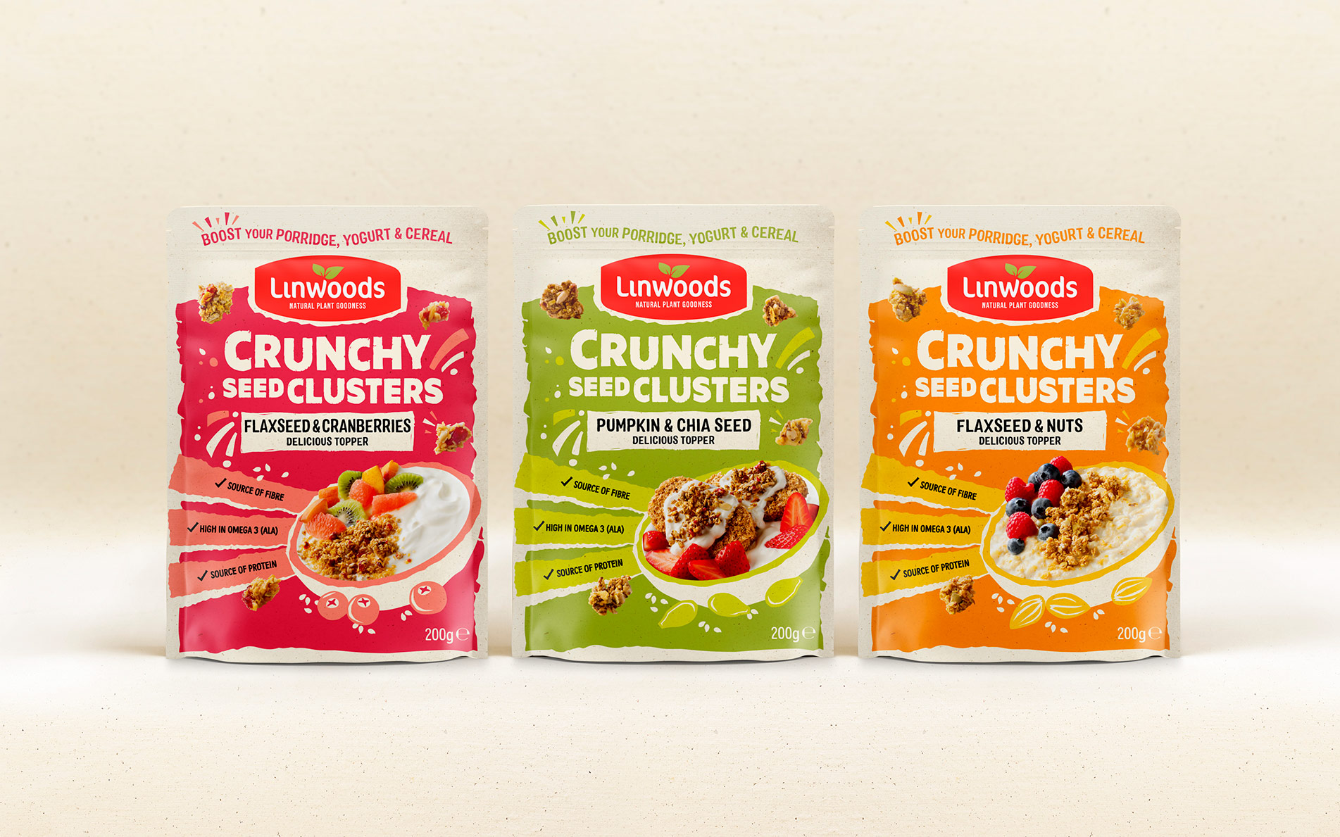
Following the successful launch of the core seeds range, we created the new pack design identities for three additional ranges, working with the team to more specifically determine the key benefits and positioning for each as a range and as a part of the Linwoods group of brands.
Crunchy Seed Clusters is a breakfast topper aimed at those with a more active lifestyle. We amplified the 'crunchy' nature of the product with dynamic textured graphics and naturally vibrant colours.
The Functional range is designed for those who use good food to manage specific health conditions. We illustrated ingredients to reflect the sense of 'real food' in its most natural state bursting from icons.
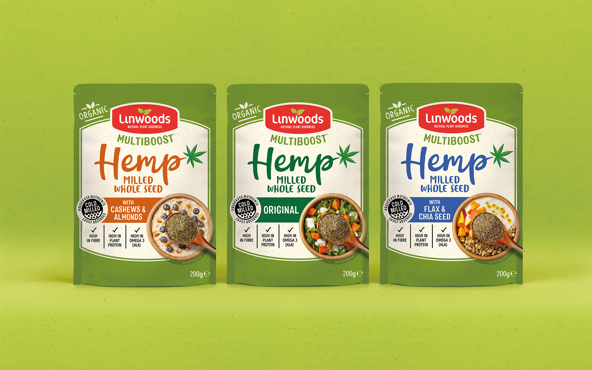
The Multiboost range was not meeting its growth potential, despite all research pointing towards the popularity of Hemp. We worked with the team to reposition the brand to elevate 'Hemp' to the hero ingredient with benefits, whilst ensuring a closer fit with Linwoods family. Inspired by 'natural remedy' label graphics, the new identity reflects the simple nutritious qualities of the product blends.
"Rylands Design team crafted a great new look and feel for Linwoods new branding, accurately reflecting our brief brilliantly into the design of the new packs while retaining the character of the brand as an authentic and trusted family company. It was a pleasure working with the team on this project and we are extremely pleased with the results."
Patrick Woods, Managing Director