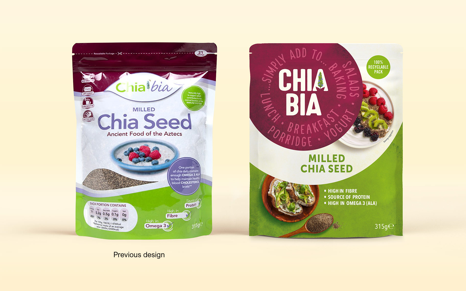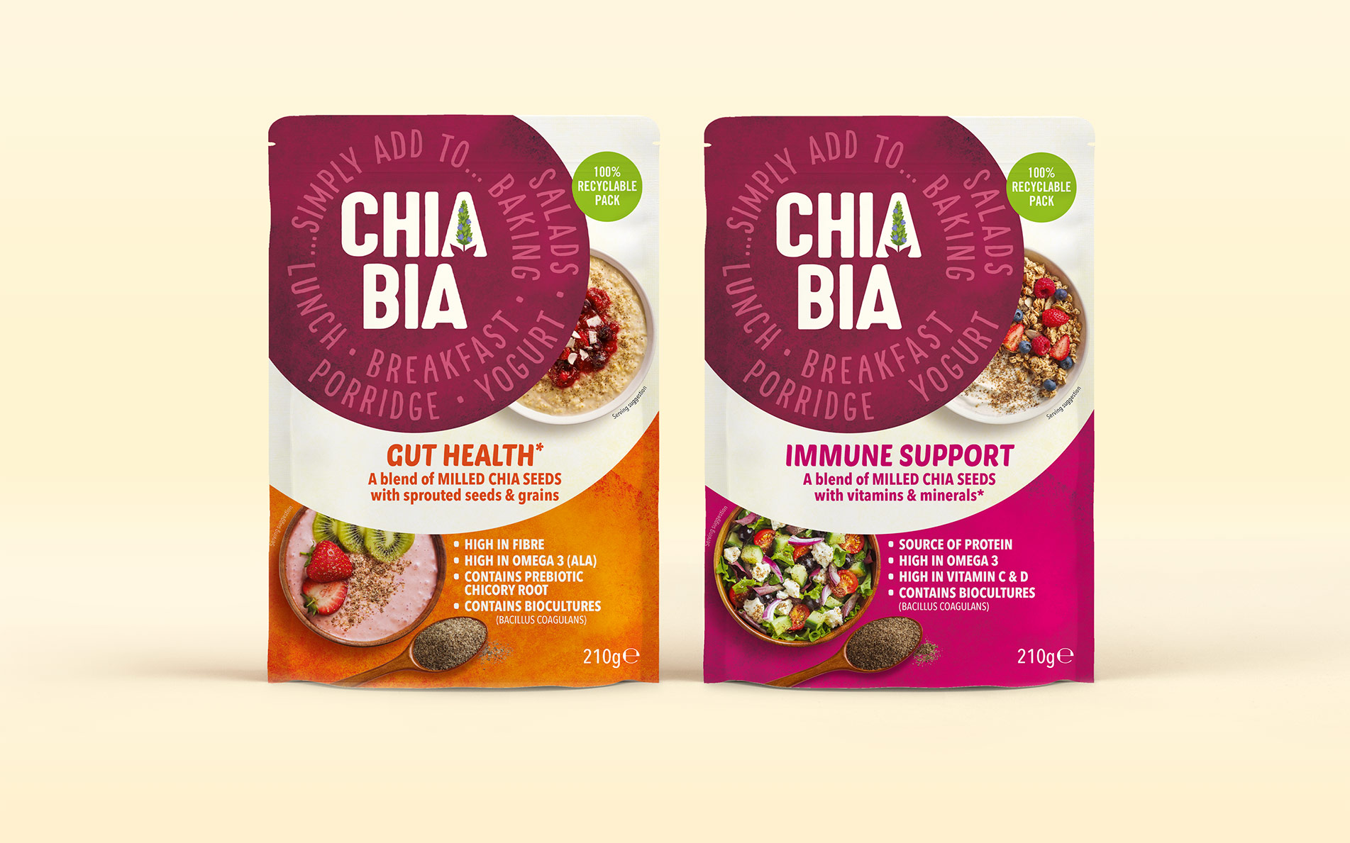
Brand strategy, brand identity, packaging design & guidelines
Everyone knows why Chia is so great. Or do they? And why would they buy a branded range? These are some of the questions we asked ourselves to determine, with the client team, a surprising and compelling new positioning for a great little company owned by Linwoods. Once the insight was established, the design objective became clear; to create an identity which encouraged consumers to experiment and experience the every day wonder of these tiny seeds.
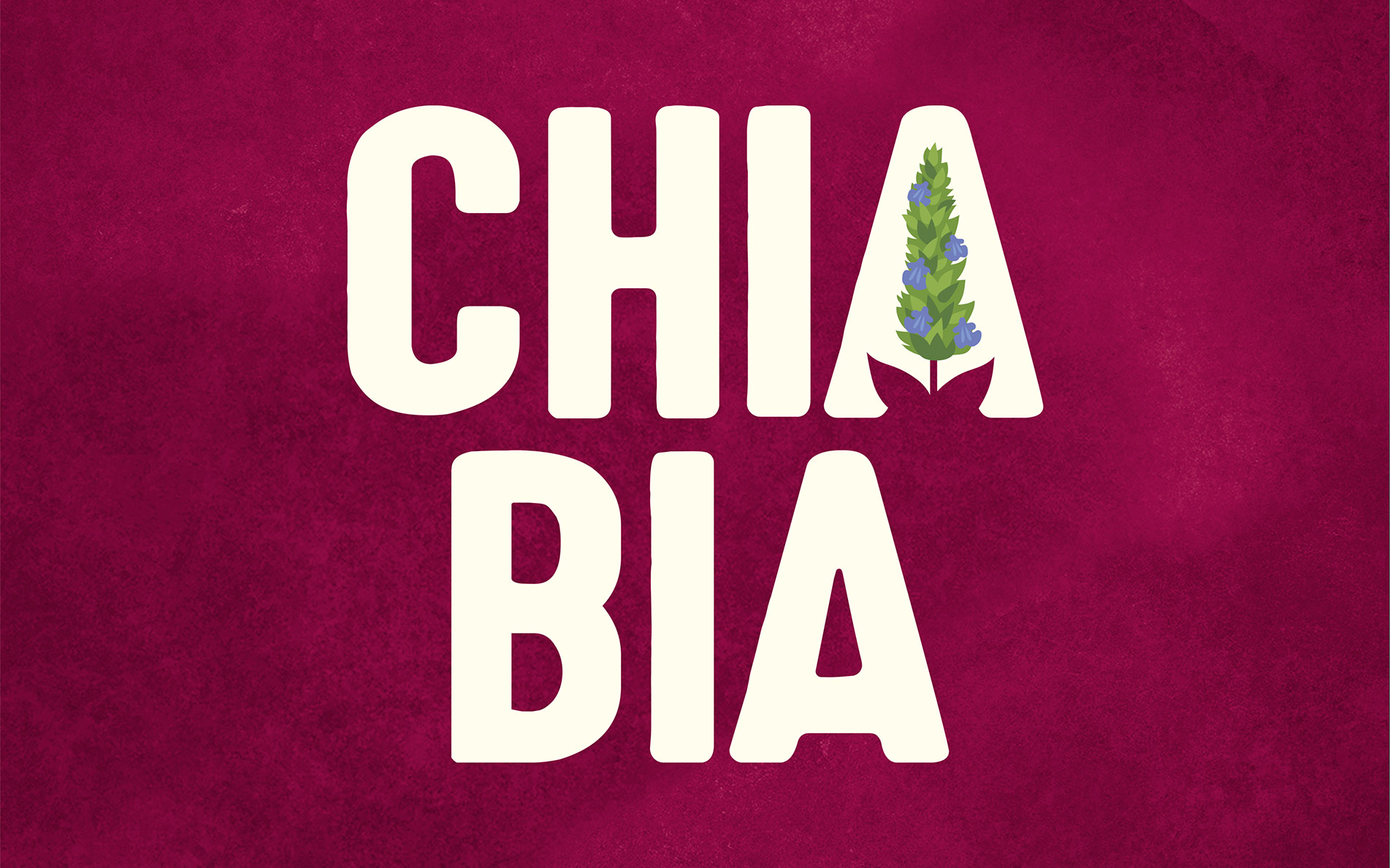
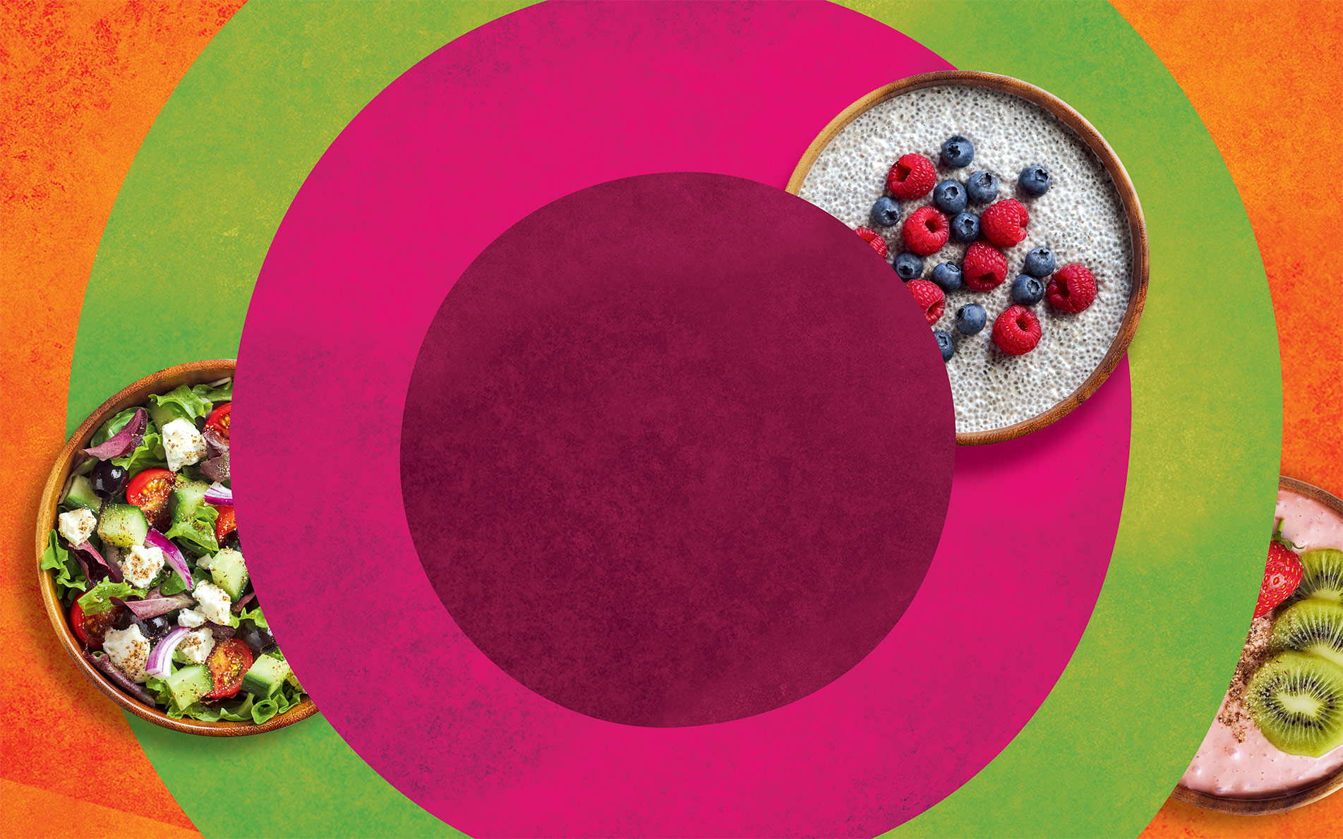
The new identity is formed from imperfect concentric circles radiating from the brand to reveal the when, what and why: meal occasions, clear product descriptors and health messages. We evolved the logo by retaining the Chia plant but cleverly integrating with the name.