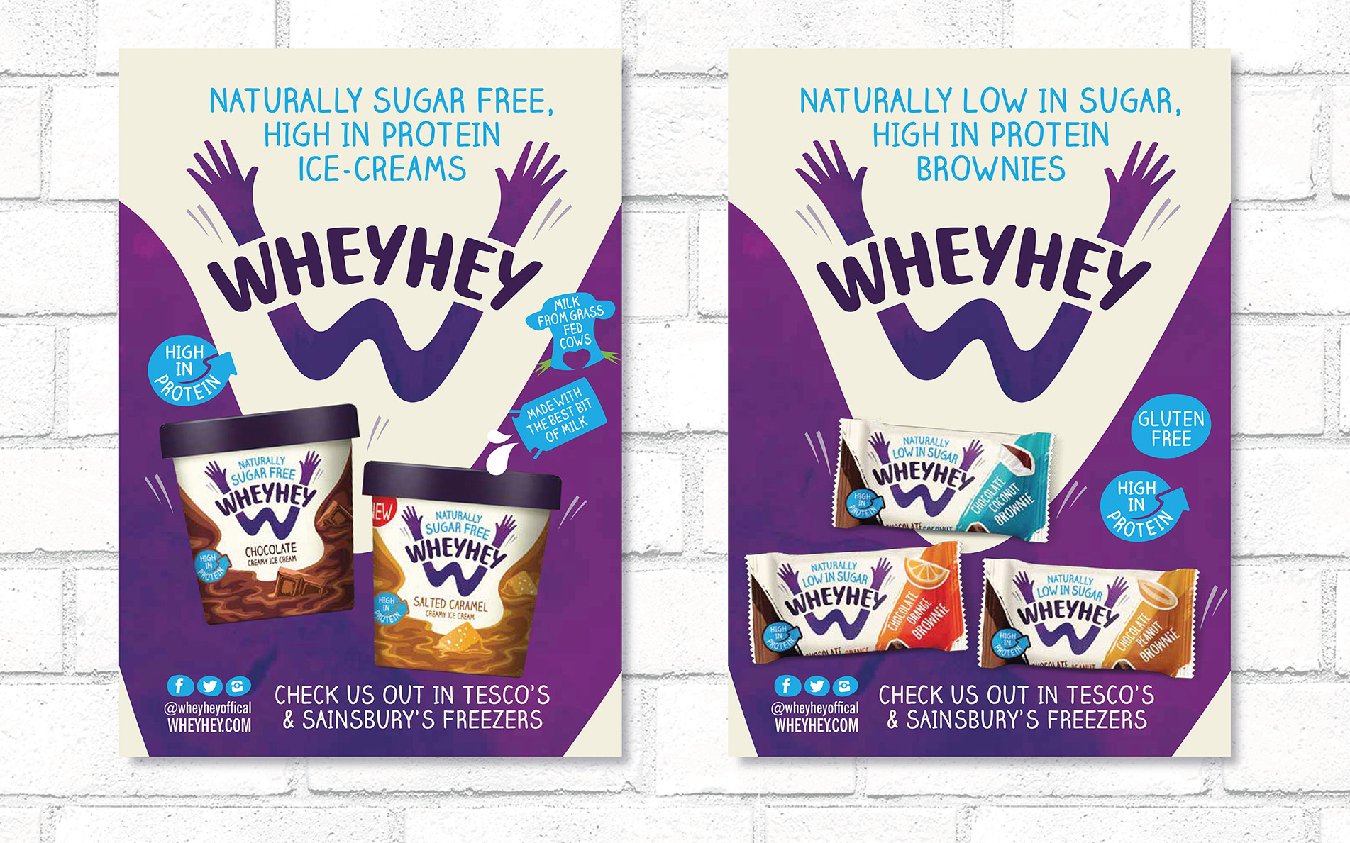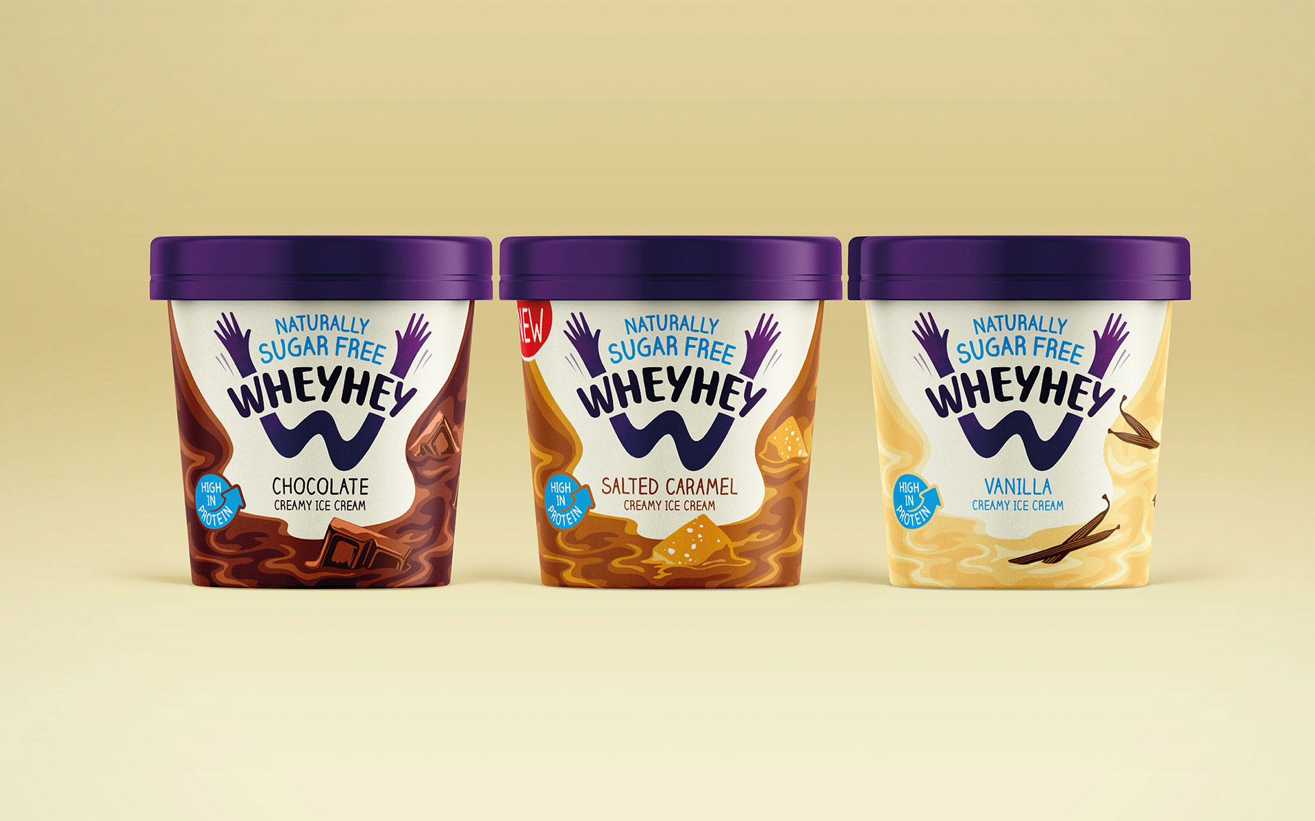


Positioning, brand identity, packaging design,
guidelines & brand collateral
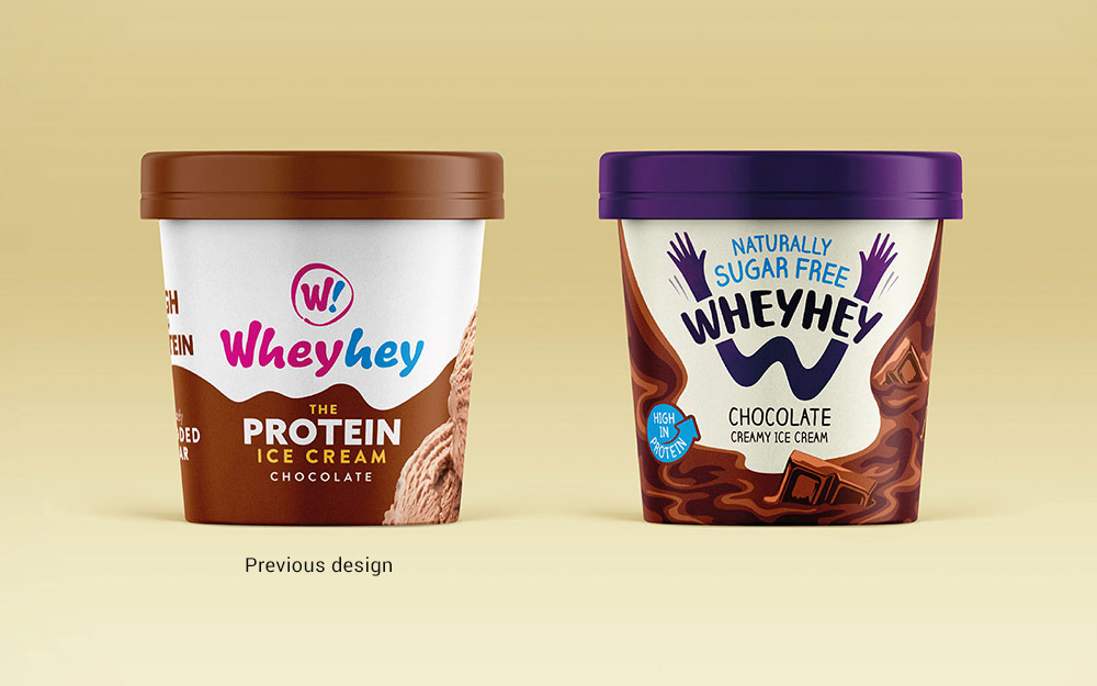
Wheyhey's original proposition was all about protein which through understanding consumers was a barrier to 'taste'. Insights led us to focus on meeting the need for better-tasting and better-for-you treats by re-routing the protein message to being a quality natural ingredient and dialling up low in sugar and taste.

Wheyhey's treats are feel good, so we designed their packs to reflect this. Most of all we wanted them to be fun...to make their consumers smile! Inspired by the expressive brand name and the fun loving Wheyhey team, we created an emotionally driven brand idea that captures the moment of joy and celebration when eating and doing something amazing. The 'hands in the air' identity idea drove and inspired further brand & marketing comms.
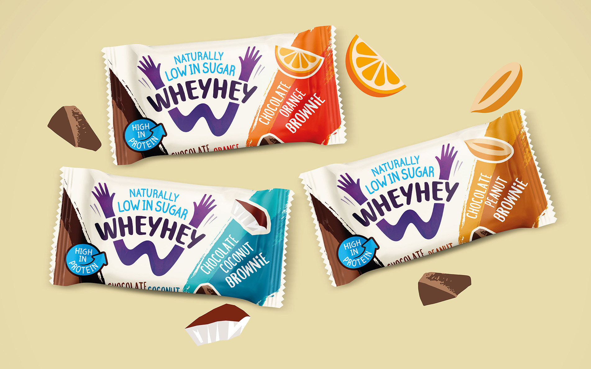
We designed the identity to easily stretch to their new range of indulgent brownies ensuring the brand message was consistent. With a bold, dynamic personality to reflect the energy benefit of the product proposition the result is a design that contrasts and captivates on shelf.
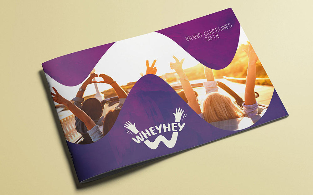
"Rylands Brand Design challenged us as clients to ensure that they had a deep understanding of the brief. They took data and consumer insight and transferred it into something meaningful, creative and in our opinion beautiful. The whole creative process from brief to completion ran efficiently and effectively. Working with RB Design it felt like a partnership and they became an extension of our team and they are our design partner for all future ventures"
Laura Hurst, Brand Manager
