Brand identity, packaging design & print
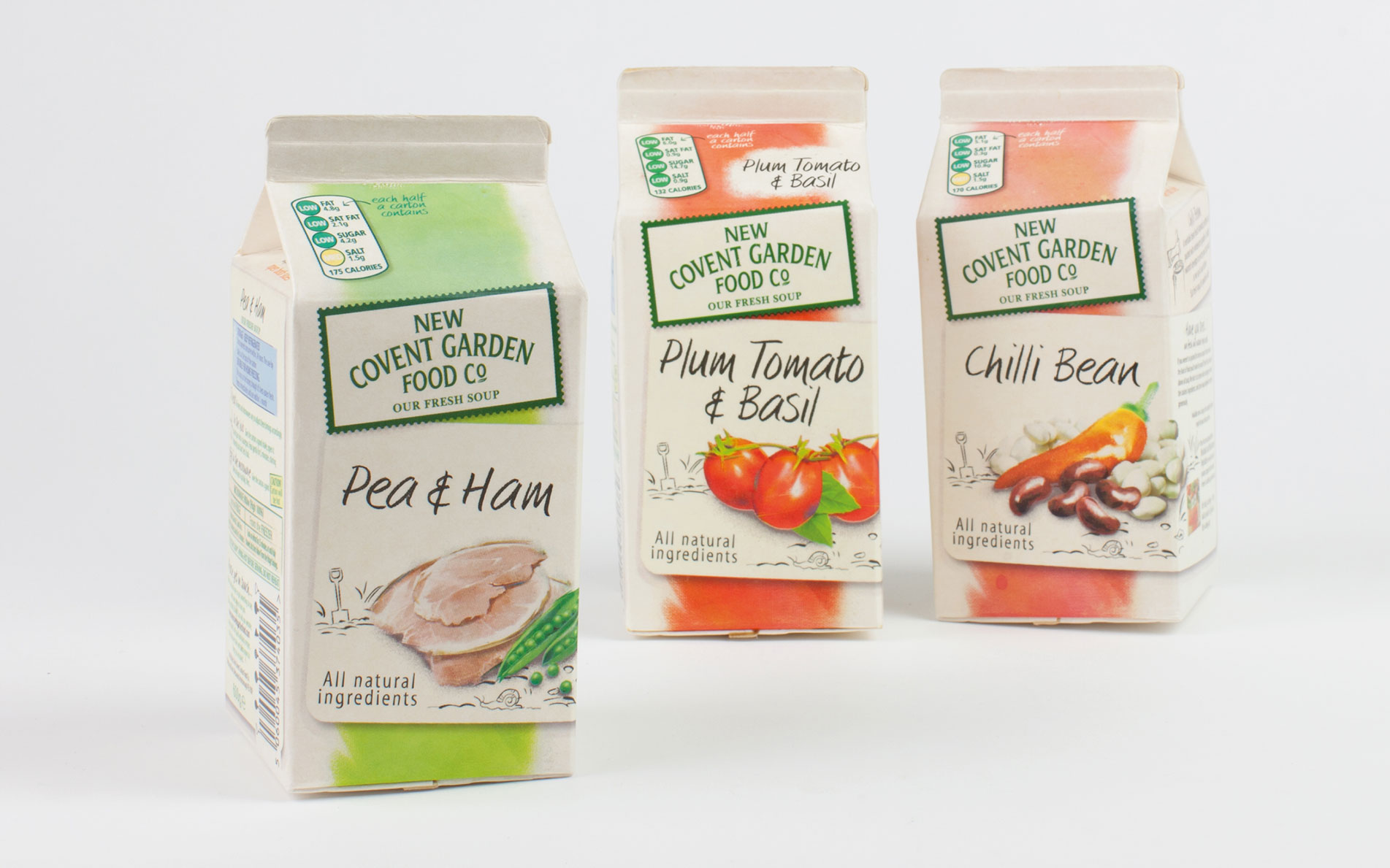
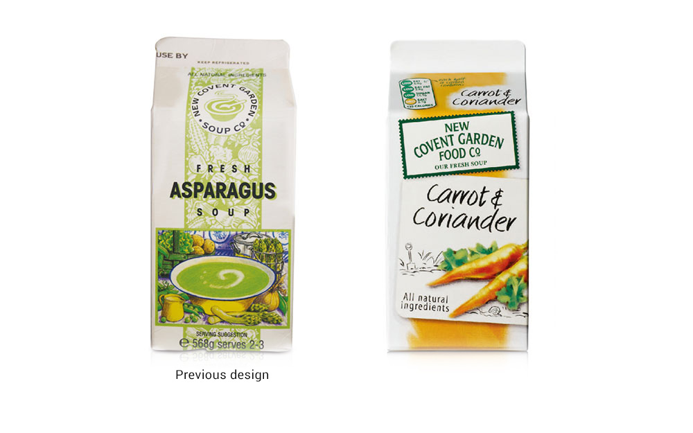
Creating the identity for the original fresh soup brand involved new design rules for the category; how to reflect the consideration and care that went into each and every batch of soup. The antipathy of mass-produced.
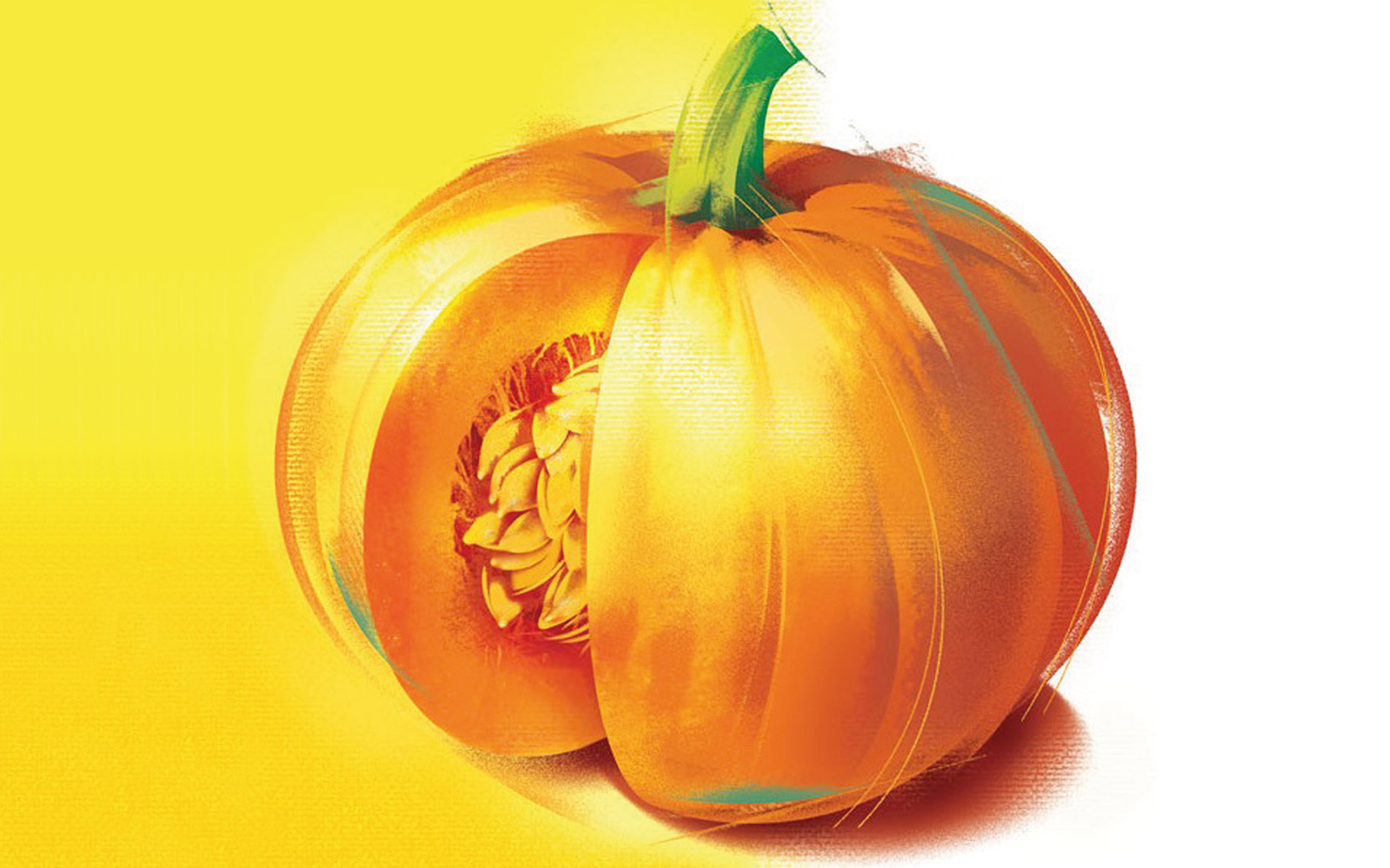
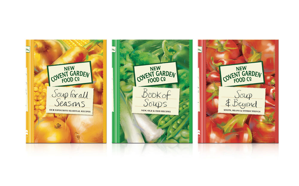
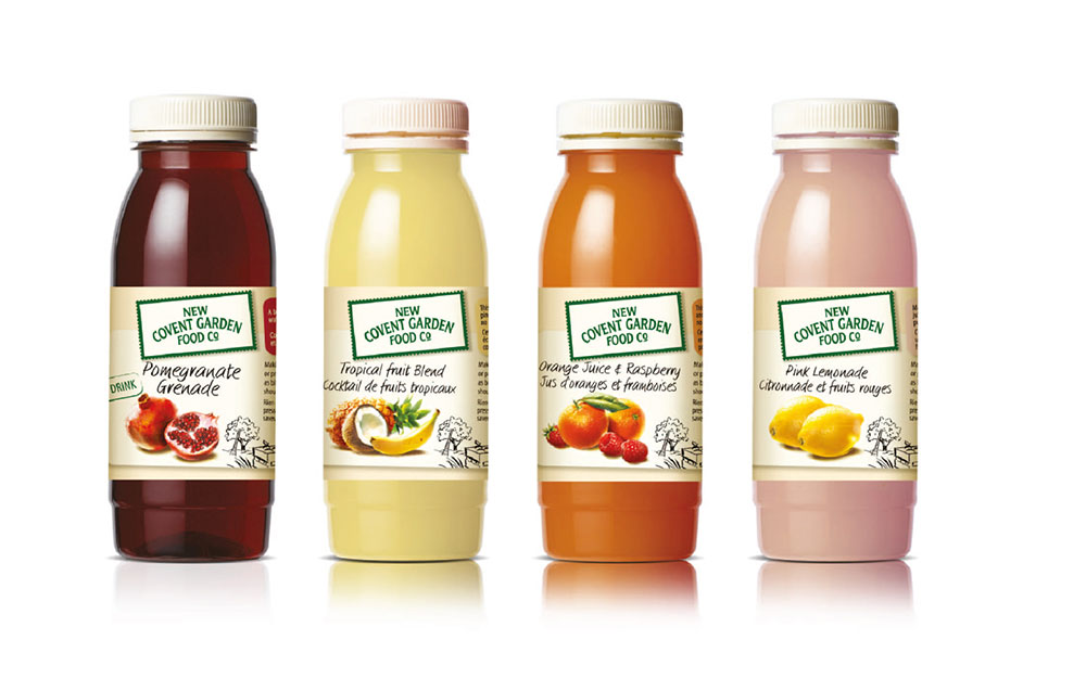
The idea of hand applied labels reflected the handmade qualities that went into every carton. The use of beautiful ingredient illustrations and hand drawn type created the distinctive idiosyncratic personality which became so well known and drove the marketing plan and vision. The creation of a brand design structure allowed the brand to migrate into new categories but still retain the equity of the brand.
The result was a challenger brand that helped define a new category. The fresh soup brand was relaunched in 2002 and the brand grew 10% every year for 10 years following the relaunch.
"RB Design identified that the core assets of the New Covent Garden Soup brand were 3 things. They successfully shaped them into a single minded idea and then redesigned the whole carton design. The business was sold in 2011 for £200m having been valued at £22m in 2001"
Nigel Parrott, Marketing Director