
Positioning, brand identity,
packaging design, naming & POS
Although there have been numerous healthy snack launches in the US, American consumers have been slow to adopt the healthier alternatives because historically they have been so very different from the many snacks Americans know and love. "Healthy" was so very worthy, serious and prescriptive...nothing reflected the fun and compelling nature of mainstream snacking.
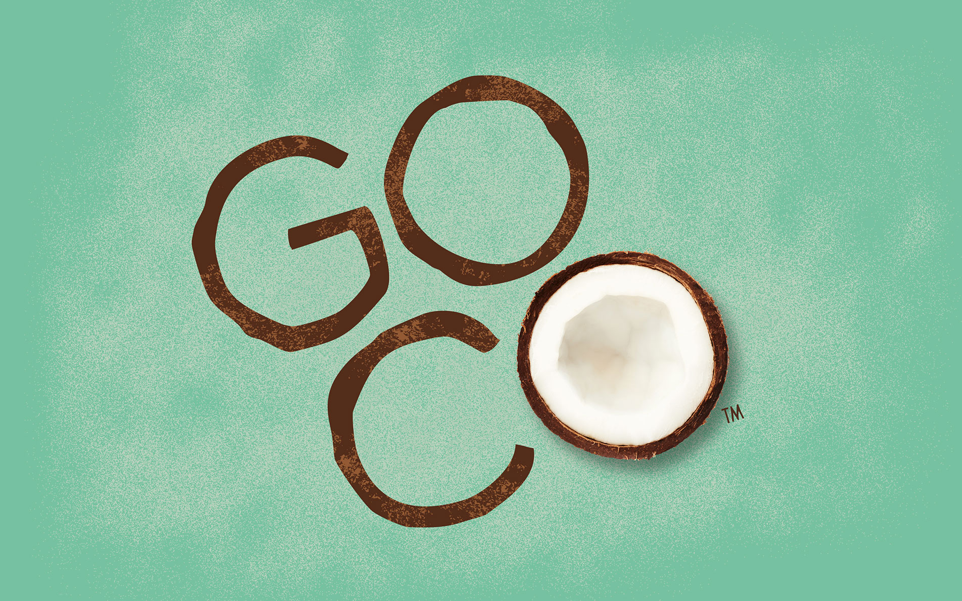
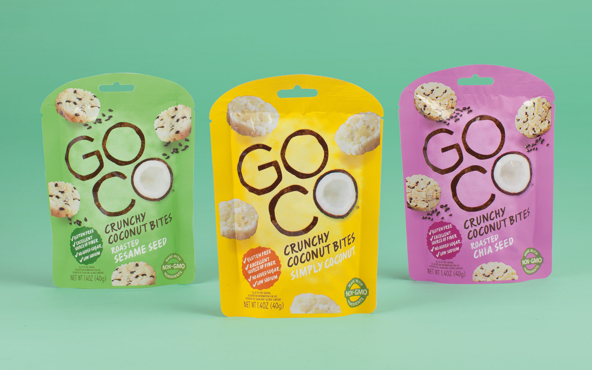
Our colourful yet simple brand creation for GOCO had a clear objective...make consumers go completely nuts for coconut! Firstly we generated a catchy descriptive brand name that conveyed convenience with a clear positioning as a coconut snack brand. To achieve the right mainstream healthy balance we delivered the need for taste in a more dynamic way with natural textures and hand drawn elements to eliminate any negative artificial preconceptions. The final result being a design that is distinctive, has great on shelf impact while clearly informing the consumer what it is and how it benefits them.